Create Column/Bar Chart :-
Create Column/Bar Chart: This video contains how to create simple & stacked Column/Bar Chart in AIV.
Only users with Dashboard privilege have access to this sectionr!
Read 5 minutes tutorial here.
- Chart widget will enable users to create customized charts using their own data to depict the data in different visualization.
- Follow the steps to create Column chart:
Go To Visualization Section From Top-Left Hamburger Menu.
Find Horizontal Menu at the bottom of the Grid, Click on Create Icon.

The Create Dashboard Dialog box will Pop on the screen like:

Enter Name and Click on Create Button.

Click on the Edit Dashboard icon from the top right corner menu, a list of the available component will open up as follows:

Click on Chart Component from the list of component into the dashboard, a configuration box would open as follows:
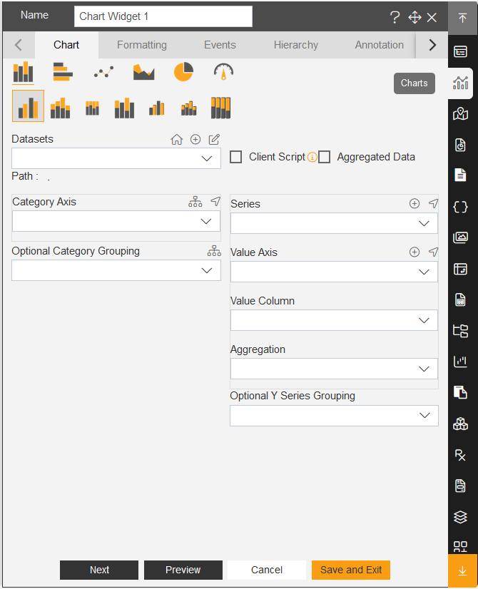
As seen in the above figure, the AIV application enables the user to create a variety of charts such as column, bar, area, line, pie as well as advanced charts such as funnel, pyramid, radar, candlestick, OHLC, variable radar and all charts with scroll.
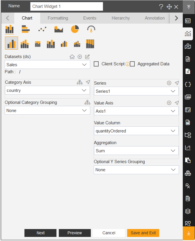
Select the type of chart you want to use and select datasets from the drop-down menu.
For our example we will be working with Pie Chart and will use Sales.cds database.
From available Data Columns select the required column from the dropdown in the Category (X).
In Value column select the required column from the dropdown.
Select appropriate Aggregation in the Aggregation option.
Click on preview.
✒️ In order to understand in detail about Column/Bar Chart, click on the following links:-